
ecoEATS: Integrating a Sustainability Feature in the Seamless App

Uniting food sustainability and delivery convenience in partnership with Seamless
Check out the prototype!
Overview
For this project, we developed an environmentally conscious new feature for Seamless called ecoEATS, which sells surplus meals at a discounted rate through the existing app interface. The idea for the project was our own, and was made without official input or buy-in from Seamless.
Methods
Team
Julia Cohen, me, Michelle Lee, and Spencer Vidich
My Main Roles
UX Researcher
Usability Tester
Timeframe
10 days
Limitations & Parameters
Because we were not affiliated with Seamless, the main limitations were limited insider knowledge of their business strategy and users. We navigated around this by conducting as much independent research as we could.
Resources & Materials
We created our designs on paper and initially tested in Marvel, then migrated into Sketch and InVision for our mid- and high-fidelity stages.
Research
For this project, nicknamed the “passion project,” the topic was open-ended, and deliverables were up to us to determine. The freedom of the project was to test our initiative and judgment. To start, we brainstormed three broad problem areas where we felt innovation was overdue in. Though we’d identified travel as our first topic, we ended up focusing on our second idea, centered around food waste (we also had as a third concept volunteering and social services).
Our proposal research into the problem of food waste started with articles and statistics on the high rates of economic and environmental waste in the U.S., along with research on two potential brand partners, Seamless and MealPal. We highlighted why they would make logical partners in our mission to address food waste. Ultimately, we chose to work with Seamless because of their simple business strategy (MealPal operates on a subscription basis) and large user base.
Here is our initial problem statement:
Environmentally-conscious consumers of prepared food are drawn to the convenience and ease of ordering food online, even though it comes with paying a premium. How might we make it easier for them to choose a more sustainable choice while finding convenient and budget-friendly food options?
Through a multi-pronged research method, we validated our problem statement and added more detail to it.
We began our research with simply assessing the business landscape of delivery and waste. We conducted this through various media outlets, academic research, and government fact banks. Some of our key findings included a $620 million savings opportunity by preventing waste in restaurants, a growing online food ordering market, a preference for pre-made over homemade, and a culture of instant gratification. These findings set up our project as significant and relevant to the market.
Within Seamless itself, we found a compelling opportunity: with over 75,000 restaurant partners and over 234,000 orders placed per day, it's a dominant platform on the rise against competitors. Even more advantageous, it’s part of a larger portfolio of food services, and goes by the name GrubHub in other cities. This would present an opportunity to initially launch in New York with the Seamless brand, then roll out in other cities under GrubHub.
Our competitive matrix plots the competition on two axes: environmental consciousness and diversity of offerings:
Zooming in on five key competitors, we conducted a feature analysis. Our findings were that features are relatively streamlined and similar. However, DoorDash and Seamless are the only two companies that offer an eco-friendly feature, though they're minimal. As companies with awareness of the issue, they could be expand upon the offerings.
We started our user interview process with a few organizing questions in mind:
What are the preferred methods and/or platforms for food delivery?
What factors influence users’ decisions to purchase food delivery, and why?
What feelings do users have towards environmental issues (specifically, food sustainability), and why?
We then put together a 6-question screener survey about food ordering habits. We asked a few demographic questions, but the key questions were about the factors that influence food purchase decisions, and which food delivery services people were using. Here are the summarized results of the screener:
We found it significant that 86% of respondents used a food delivery service in last 3 months (indicating the potential marketability of our feature), and that Seamless is the most popular food delivery service of choice (indicating the potential of. our chosen partner).
In our 8 interviews, we asked questions that touched upon general food delivery preferences, a specific food delivery purchase (most often the last purchase), environmental consciousness, food-related environmental issues, and final thoughts.
In addition, we conducted 3 in-person contextual inquiries, watching users interact with the Seamless app while placing an order. These were the questions we were hoping to answer and our results:
Synthesis
To synthesize our research, we made an affinity map, clustering key findings into insights that could inform our personas and design decisions:
The main findings of our research were centered around three themes:
Credibility & Trust: Communication, transparency, and reviews are top of mind. Users prefer to order from food services and restaurants they are already familiar with.
Good Intentions Gone Unfulfilled: Environmental consciousness is a concern, but convenience is king when it comes to takeout.
Budget vs. Convenience: Food selection is determined by cost and delivery fee, but users feel guilty about spending too much on takeout.
From there, we distilled our findings into two personas that reflected Seamless users who might use our feature.
Our primary persona is an eco-conscious user who wishes there were a better way to juggle convenience and environmental friendliness. She would potentially be drawn to the eco-conscious part of our initiative.
Our secondary user is more of a budget-focused user. He might be most drawn to the cost reduction factor of our initiative.
For our primary consumer we mapped a user journey, focusing on the opportunity to offer items of good value at a lower price point, and more flexibility in sustainable purchasing:
Finally, we crafted our revised problem statement:
In a “takeout” culture defined by instant gratification, people prioritize convenience first. These people opt for takeout because it’s convenient and easy, but they feel it’s a bad habit — for both their wallet, and for the environment.
After late nights at work, Chloe opts to order takeout from Seamless, but wants to make a more cost-efficient and eco-friendly choice.
How might we help her feel better about her decision to order takeout, without paying a premium?
Before we began sketching, we mapped out a task flow for how a user would place an order on Seamless’s mobile app, so we would have it for comparison. We wanted to be sure that our additional feature would retain the ease of use of the current app:
Ideation & Design
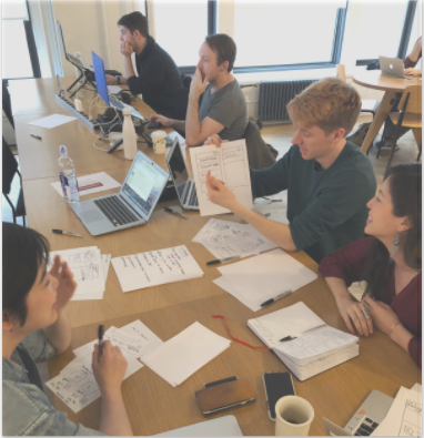
We then began a 2-round design studio with the goal of rapidly finding design solutions collaboratively.
In our first round, we found a few themes:
Feature should appear with “deals” on homepage
Photo uploads and offer incentive
Eco-friendly “ribbon”/”indicator”
Our second round also converged a few ideas:
Serve up geo-located options new feature (or deals near you)
Use a positive word while naming the feature (i.e. users will be turned off by “waste”
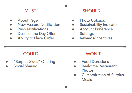
With those in mind, we did a feature prioritization exercise through MoSCoW mapping, separating must, should, could, and won’t have features. For the sake of our 10-day exercise, we built out just the must and should haves:
At this point, larger themes were converging, and we felt confident enough to prescribe a solution to our problem statement. We played around with hundreds of combinations of names, quickly A/B testing them on potential users, before settling on one:
As we created our sketches, we mapped out a task flow for how a user would place an ecoEATS order:
We also created a user flow for placing an order multiple ways with our new feature:
Finally, we set a color palette that made sense, adding a green color for our banners and branding:
Our platform rationale was solidified as iOS native app, with the benefits of tailoring to on-the-go customers (7 out 8 users had specified app use over desktop), the ability to send push notifications to let customers know about limited availability deals, and geolocation for driving recommendations based on the user’s current location.
With that in mind, a few of our key frames are below:
First, we developed a landing page to help users learn more about the new ecoEATS initiative. It gives background on the project for first-time users, and leads back to a shopping page with all the deals for the day.
The second screen is an offshoot of the ecoEATS landing page. Here we’ve developed a loyalty program and tracker for repeat customers. For every 10 meals ordered, they receive a $10 Seamless credit. Users can see their progress towards the next credit, track their total dollar savings, and opt in to push notifications.
Our next screen is the home screen with our ecoEATS banner. You can click the i button to get more information on the initiative. This generates a popup with one line, so users aren’t overwhelmed if they’re in the middle of ordering. To get the full description, they can click the learn more button, which takes them to the ecoEATS landing page, our first key frame.
Finally, our fourth frame is the restaurant landing page with ecoEATS daily deal highlighted in green. There’s also the option to learn more with the i button. Throughout, you’ll see we’ve used our visual branding cue of a green bowl.
To see our iterations through the rounds, we annotated four key screens through each variant. Below is our iteration on the home page:
Testing & Iteration
Our usability testing comprised 16 tests over 3 rounds. For our KPIs, we set out to measure success rates (Y/N on whether task was completed), time spent on tasks, error rate (number of wrong clicks per task), and ease of use as reported by the user on a scale of 1 to 5, 1 being easy and 5 being hard. Overall, we were hoping to assess how well our design mirrored Seamless’s current app while calling attention to our new feature and its functionality.
We tested three tasks for each of our rounds. Our first round tasks, tested with our Marvel prototype, centered around ordering food through browsing vs. through searching, and updating account settings to be eco-friendly. Though our metrics were relatively positive, we found there was confusion that the tasks seemed similar, so we decided to heavily revise our tasks before the next test. See our results below:
For our second test, we updated our tasks to learning more about ecoEATS, ordering a meal from a new restaurant, and reordering from a previous restaurant:
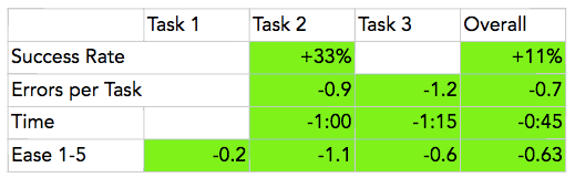
Our third and final test had very similar tasks, and after incorporating changes from our first and second tests, we were pleased to have improved metrics:
Overall, we were able to achieve an increase in success rate, shave off time and errors, and achieve a lower score on ease, indicating that our tasks became easier as our design became more user-friendly. See our table of improvement rates from round 2 to 3:
Next Steps
To wrap up, we put some thought into how the program would work logistically:
In addition, we offered business rationale for why it would work:
Finally, we considered the next logical steps:
If implemented, we would also carefully track food waste reduction to measure the impact of ecoEATS, with the hope of one day putting a dent in the massive food waste metrics outlined in our overview.
Reflection
Though there were some group tensions with this project due to differing work styles, it was gratifying to have the freedom to set our own schedule and deliverables, and prepare a presentation to a small group of stakeholders that we didn’t know ahead of time. Their questions about the business strategy and design process helped us refine our next steps. I’m pleased with the final product we made and believe it’s a real potential solution to the food waste problem while being realistic about users' need for convenience.
Deliverables
-
High-fidelity wireframes
-
Clickable prototype
-
Specifications Document


RESEARCH:
-Business Research
-Company Research
-Competitive Matrix
-Competitive Feature Analysis
-Screener Survey
-User Interviews
-Contextual Inquiry
SYNTHESIS:
-Affinity Mapping
-Persona Creation
-User Journey
-Task Flow
IDEATION & DESIGN:
-Design Studio
-Feature Prioritization
-User Flow
-Paper Wireframing & Prototyping
TESTING & ITERATION:
-Usability Testing
-Digital Wireframing & Prototyping
-Iterations